Wednesday, December 21, 2011

Definitive technicals as applied to the ECRI WLI

Am picking apart some definitive technical analysis as applied to one of arguably few reputable economic indicators, the ECRI Weekly Leading Index (WLI). Leaving aside all and any assessment of it's application to any purported economic reality, this exploration is purely technical analysis of the publicly available WLI data series, and provides a summary of where it sits amongst the myriad of purported recoveries or otherwise as regurgitated daily by the main stream media.

I cannot suggest if this data series has either a linear or power series (compounded, polynomial) relationship to the broader economic state of play, and merely present several methods of analysis that indicate the possibility that all is not what it seems.

Whole of data series linear regression showing +/- StdDev bands


The most obvious 2 observations are a) the rate of increases into 2007, broken by b) massive correction to the underside in 2008/09. This parallels with the observed outcomes of the GFC in 2008. Note however the WLI did not foresee the 06May2010 flash crash, yet the WLI responded to this event very abruptly. There is a 6 standard deviation correction to the March 2009 low, and we currently reside -3.5SD's under the linear regression average. Obviously a weak recovery to date.

Note that this data series started during a period of 8 years indicating economic stagnation from 1967 to 1975. This is fortuitous since it allows a direct comparison to what might be a similar period as indicated by the ECRI WLI currently in 2011, from the June 2007 high.

Same whole of series, added moving averages (short, medium and long term)

- moving averages most clearly show momentum, and comparison to previous trend movements

When analysing many instruments and asset trends, there is a distinctive increase in rates of change and cyclic volatility from 1996 onwards, attributable to a marked and definite increase in electronic analysis and trading, and easing of market access coupled with excitement and fervor over the technology sector. This euphoria would eventually end in the very public bursting of the dot.com bubble and reveal massive stock price manipulation in what was to become the new black in IPO's spinning and laddering. For this exercise, I am using the point that it last departed above the current linear regression average (being 1995) and using January 1995 so as to commence with a whole year.

Closeup of linear channels 1995 onwards


Applying some simple moving averages to the data series further highlights that we are yet to clear the obstacles of the GFC of 2008. As can be clearly seen in the following chart, with the addition of some Fibonacci levels

- showing major trend lines overlayed also

Combining some RSI and MACD analysis (not shown) of the ECRI WLI analysis, we can see a prevailing weakness in the forward movement of this Index indicating upwards direction being weak and limited, sideways trending being very likely and a possibility of a further decline into a dip and recovery within the next 12 months to Dec2012.

Low order dynamic bands applied to 1995 portion


CONCLUSION: Current situation indicates clearly we are still in a period of sustained weakness showing no immediate recovery. Momentum is negative (downwards)  while a rise is not impossible, it is merely rallying in a down trend (a bear rally). Confirmation of a clear break of this downward trend is an ECRI WLI reading above 125. I would mark a recovery to resumed growth as confirmed only above 129.

Using a Dec1971 value of 60, and applying 2% CAGR to the ECRI WLI, we project a value of 132.5 for Dec2011. Clearly we are below this. Given that we are also below linear regression of 138 by some 3.5 standard deviations, it does suggest that the universe is conspiring aginst mean reversion, and that upwards progress is imminent. Mean reversion and regression to trends are poetry when you are placed on the right side of the move.

Very simply, upwards is a good thing. It's a matter of getting it there, and keeping it there. Eventually further growth will become the most obvious certainty. But timing isn't everything, it is the only thing. The downside is that we are in a period fo 6-8 years that is sideways to down still. I respect the lucid and thorough Kyle Bass who suggests large corrections to housing markets last anywhere between 6-9 years. Using 6 years aligns with the previous history of the ECRI low in 1975, placing another  possible cyclic low still to come in Dec2012.

Hence I would put a floor of 120 not to break (must hold), and a ceiling of 129 that it needs to break (confirm recovery and growth) - buy the dip, sell the fade in the mean time.
Regards,

Sunday, December 4, 2011

Analysis of Australian Trade - Part 3 of 2

Part 1   Part 2

In the spirit of the great Douglas Adams' Trilogy of 4 books on the Life, the Universe and Everything, this is now Part 3 of 2. It could easily be much more, but this was intended to be a first level break down of our trade performance only. Unfortunately I couldn't find 42 as the answer for anything in this 3 Part appraisal.

This final part wraps up with current trend growth rates including GDP. As a result of 2 recent online video clips (highly recommended viewing; being the Munk Debate Japan vs USA and the Kyle Bass Redux) I am slowly joining the dots on what seems to matter in the broader sense of national account trends. The biggest 2 points of difference I see between Japan and the USA (at least so far) are (a) the population pyramids (demographic trends) and (b) natural resources. I plan on getting around to some in depth analysis on both Japan and the USA at some stage, but have focused on Australia in these series.

So it is with thanks to these recent insights, that I see population growth rates as equally important to economic analysis as anything else. This is probably due in part to the PPP (purchasing power parity) used in FX valuation models when reducing of many key economic indicators to per for capita comparison. As a non-economist, being a self taught hack the importance of many seemingly relevant yet inquisitive tangents crystallizes after the fact.

(nominal, current $AUD, periods as noted)
AUSTRALIA'S GDP TREND


Presently, nominal current $ GDP growth is running at 8.2% YoY down from 8.5% the previous quarter. Deduct CPI for approximate real GDP growth as the balance. While this number looks supremely healthy, there is a good argument to be made that is has to remain so in order to maintain the present status quo. A real GDP growth limit of around 2% has been set via general consensus of US analysts that is the threshold of sustained positive impacts (above 2%) and sustained negative impacts (below 2%) on unemployment.

The linear regressions of the nominal GDP growth rates indicate a long term slowing down of growth. This is certainly in line with current uncertainty in the global arena, and supports this being Phase 2 of Australia's progress of development from an Emerging Market. The addition of the population growth is considered important. It highlights any deterioration in GDP/cap - a measure of standard of living. Essentially if GDP growth drops below the population growth, it can provides a signal for economic contraction. In simple terms, local conditions would then be dependent on the corresponding movement in the overall money supply as to the prices and available credit. The reductions in GDP growth also correlate with larger trends in the US and Japan.

The numbers on this for Japan would be intriguing, given it is forecasting a reduction in forward population. In Japan's case, if the reduction in population rate exceeds the reduction in GDP, it is still seen as a sign of prosperity per capita, however money supply and other capital flow factors beyond the scope of this author would be of higher consideration. However there remains something in the PPP FX calculation that is causing the ongoing appreciation of the YEN - perhaps the rate of reduction of $economic $indicators is occuring at a slower pace than the rate of decline in the Japanese population? (a guess).

TECHNICAL ASSESSMENT - of rates of change, poly and linear
Without delving into the many and varied valid reasons behind the use of non-linear (polynomial) and linear regression curve fitting, the following are the results of relatively mild 3rd order polynomial versus linear regression analysis of each of the 7 trade data sets using the Jan1998 to Sep2011 data range (23years).  While the choice of range is arbitrary (can be more 'local', as in a shorter time series using less data), I have done this using the full range of available data that I have access to from the ABS.

LINEAR REGRESSION OF TRADE TRENDS


NON-LINEAR POLY REGRESSION OF TRADE TRENDS


The charts above are a warning that any likely regression to the linear mean results in a negative trade balance. Numeric representation of the above charts is provided in the summary table below.


Tracking with the nominal GDP growth at 8% should be a reasonable target average for non-linear curve fit. Should GDP not sustain 8% it stands to reason what the ensuing result for the trade balance will be.

Since I included the net-trade BOT G&S less merchandise calculation, I realised the non-merchandise BOT might be a warning. It shows the worst deficit trading non-merchandise has ever been, and is 3x (a 200% increase) on the previous 20 years worst performance. I have not the means to identify the composition of this net deficit. Thanks again for the trade surplus due to our resources and primary industries!

Our present handling of our surplus trade categories is not a positive sign for the future prosperity of Australia in any extent where we depend on a sustained surplus for our standard of living being derived in the current manor. In time, I hope to dig deeper to see which are our greatest rates from change with respect to shrinking surpluses, and expanding deficits.

That's enough for now I think.
Part 1   Part 2
Regards,

Saturday, December 3, 2011

Inside Australia's trade performance - Part 2

Part 1   Part 3

In continuing Part 2 of the analysis of Australia's trade performance, I have updated Part 1 (charts & text) to clarify the Merchandise Categories of that initial analysis. The whole of the Balance of Trade (BOT) is presented in this Part 2 which is Total Goods and Services as per the ABS data series. In doing it this way, you will see that Total Balance of Trade trend is comprised of 60% Merchandise Trade anyhow, and the two trends are not discernible at a casual glance. Even under scrutiny, the trend analysis from Part 1 shows to be more than valid for forecasting possible future trade balances.

Also I show where this trade is coming and going from by Country, as well as the contribution of the trade by Australian State (that is sure to excite some justifiable interstate arguments). Finally some facts and figures on GDP are presented in Part 3. What is of increasing concern is the amount of volatility that can be seen in the late stages (since 2008) of the mature growth curves. Volatility is not stability, and history dictates that in mature curves (>30 years), above average rates of increase are not sustained, with pullbacks (corrections) typical of what was seen in 2008. The frequency to which they occur is dependent in part on what can be done (if anything) to stabilise the underlying growth (regression) back to sustainable values over the longer term. The Australian GDP charts indicate this very effectively in Part 3. Presently, our GDP growth has returned to 8.2% growth YoY as measured at last quarter Jun2011 - this was down from 8.5% YoY as measured in Mar2011. Modern GDP growth (post 1990) peaked at 9.1% during 2008. Point being, what underlying natural rate of growth is sustainable that smooths out the recent volatilility? or is volatility here to stay?

(nominal balance, AUD $Millions, monthly except where indicated)
AUSTRALIA - TOTAL GOODS and SERVICES BALANCE OF TRADE (1971, monthly)


AUSTRALIA - GOODS and SERVICES versus Merchandise (1988, monthly)


Hence it's obvious the trends of the BOT and Merchandise are virtually one and the same at cursory glance. Merchandise represents 60% of all of Australia's trade, of which we already know is better than 80% resources. When you remove the merchandise balance from the total balance, the remaining trade is remarkably closely net neutral (balanced), as per below, {edited} showing recent sustained deficit since 2010 - offset by recent boosted growth in resources export revenue.

AUSTRALIA - GOODS and SERVICES LESS Merchandise (1988, monthly)


Merchandise surplus is 60% of trade account credits, while deficits are 55% of trade account debits. This adds further credibility to the argument that the ongoing resources boom is the only thing keeping Australia's trade balance in the black. Any marked change to global conditions will catch Australian politicians with their pants further down than they already are.

AUSTRALIA - Top 7 surplus trade partners

*worth noting that up until 2008, China was our second worst trading deficit partner, behind USA. Now it is our second highest surplus partner due only to an insatiable (so far) demand for resources, mainly iron ore and coal.

Further to the concern that China is only recently our new best friend (since 2008), is that the 7 countries above represent a staggering 90% (!!!) of our total surplus merchandise trade. This introduces a more worrying national security issue brought about by our inherent dependency not only the large volumes of few resources, but the tightly located (and colocated) market region to which they are served. Any instability in the East Asia/APAC region that disrupts any of these major surplus export partners can alter the flow of trade, placing these resources (or any of the major surplus trade categories) with increased strategic importance from a foreign policy point of view.


Equally importantly, Australia must not only encourage alternative export markets, but also be proactive in assisting in the resolution of trade barriers that might disrupt existing or future volumes. This is not excluding assisting in the development and/or application of new and better efficiencies/processes/technologies in adapting to changes in environmental requirements of heavy industry and energy resources.

AUSTRALIA - Bottom 7 deficit trade partners

* USA and Germany have been consistently worse deficit trader (predominantly defense, vehicles, and technology). Note the large volatility now seen in UK trade. This is masking a deterioration in the UK trend (into deficit).

By contrast with the Top 7 contributions to the surplus, the above 7 deficit trading partners contribute 57.5% of the total deficit trading. This difference in concentration (of influence, or spread of contribution) introduces much greater difficulty in forcing any rebalance back into any future imbalance. Since exports are explicitly dependent on global demand and pricing factors, whereas imports are increasingly driven by a growing lack of local production/G&S imbalance and (often poor) consumer discipline. The latter being where the US now finds itself with overwhelming challenges.


Current policies will provide very little defense to arrest the outflow of capital due to the nature of our increased dependency on imported produced goods. Further work is needed by this author to identify the largest rates of change of deteriorating surpluses, and increasing deficits.

AUSTRALIA BALANCE OF TRADE - by State
As is obvious from the charts below (and to those with an ear within 1 foot of the ground), Western Australia is well within it's rights to dominate any discussion on policies concerning resources, followed by Queensland as a distant second.These 2 states dominate the export of natural resources coal, iron ore, aluminum, copper and natural gas as well as livestock and other large primary industry contributions. It is surprising given the large surplus trade for Queensland, that the balance shows periods of substantial cyclic offsets with the underlying balance well short of Western Australia. Hopefully this is indicative of broader development and needed improvements (yes, I'm a Qlder).


WA is tracking the ongoing growth in iron ore exports, having surpassed coal in 2010. Qld has not followed the sustained coal export trend as it must be offsetting against rising import consumption so far for 2011.

It is obvious the 2 southern states of NSW and Victoria are large net consumers and outstrip the combined balance of the remainder of Australia excluding Western Australia, making even more obvious our growing dependency on resources. It sounds like a broken record doesn't it? Likewise, there would be no policies in place to address this imbalance of capital flows, with the recent grab for capital by this Federal Government coming from WA, and to a lessor extent Qld and SA. This author has his own personal opinions on the likely success (or otherwise) of the MRRT tax restructure, that is now largely intrinsically dependent on the extent and nature of FDI and the foreign controlling interests in our natural resources (privately held or public listed).

In short summary - the above combined analysis shows that Australia's surpluses are tightly concentrated, while it's deficits are widely scattered. Addressing any imbalance arising from conditions beyond our control (and pretty much anything will be beyond our control) is going to be a long distance outside current considerations of this present (or even previous) Governments. In terms of investment positions and future risk, Australia has it's bare arse facing the wind - this is presently an undesirable all or nothing unhedged position with respect to resources. Good while the going is good, with plenty of downside when things go pearshaped.

Being in this position would make any sensible person more protective of the goose laying the golden eggs. But those people do not find themselves in politics. Does this Government have any contingency plan in place for considering future trade impairments? Judging by the recent knee jerk hysterics that resulted in the disruption of the live export market, the answer is obvious to this author. But it's important for people to understand why large industry lends a heavy hand from time to time.

We used to have more local industries than we presently do, and the numbers are getting tighter for many more of them.

Part 1   Part 3
Regards,

Thursday, December 1, 2011

A detailed look inside Australia's trade performance

(edit) Part 1 of 2 - Merchandise Trade Series (update to charts)
There is not a large correlation between trade surplus and broad investment market performance, but trade surplus is a resultant of local and global conditions, and is paramount for small economies like ours in funding the social policies of Government. That includes its own growing cost burden of operation. Trade deficits result in the risk of foreign ownership of growing Government debt, which is never a good thing for small economies.

Our performance of external trade identifies the obvious and critical nature of the current global commodities demand in providing much needed funding for all current policies (whether they are good or bad). The best and worst performance of our trade balance is provided below. There should be few surprises, except where cumulative policy decision of the past have incurred a detrimental response to certain subsectors.

As can be seen, the extreme recent volatility in merchandise trade balance is foreboding in providing a wide projection range of future balances in the near term. -$3Bn Nov2009 to +$4Bn in Jun 2010 is a swing of $7Bn in less than 12 months, which immediately followed a less volatile dip of -$5.5Bn resulting from the GFC. Despite 6 prior years of increasing commodity export, it took until the GFC May2008 to generate trade surpluses sufficient to overcome growing trade deficits.

(edit) During the worst of GFC 1.0 in 2008, monthly export surplus dropped $7.5Bn (or a massive 43% decline!). Corresponding deficits dropped only $5.0Bn (only 33%) resulting in a return to deficit within a 12month period. What's worse is deficits recovered before surplus indicating we are more sensitive to external conditions for our continued prosperity, and more dependent on externally produced goods.

Merchandise Trade Balance closely follows the trend for total Goods and Services Balances (see Part 2, our Balance of Trade)

Optimists will say this is simply recovering to a pre-GFC upwards trend, however these people will be ignorant to the highly cyclic nature inherent to Australia's trade balance. The cyclic volatility provides no assurances in this current climate of global uncertainty, and China has only very recently (since 2007) become a major trade surplus provider for our Balance of Trade (BOT).

(nominal balance, AUD$Million, FOB values)

MERCHANDISE TRADE BALANCE - 1998 to 2011, monthly


ZOOMED UPTREND, TRADE BALANCE - 2006 to 2011, monthly


Breaking this total balance down into composite trade items, reveals the best and worst performing categories. Not surprisingly, our commodities and primary industry provides the lions share (well over 80%) of monthly surplus trade resulting in $17.2.0Bn surplus (monthly, Sep2011); against which $13.5Bn (monthly) is offset in deficit trade categories that are more numerous and less concentrated.

Best 7 Merchandise surplus groups (including combined aluminium, combined copper)

(Top 7 surplus shown accounts for 79.7% of total +$17.2Bn trade surplus Sep2011)
* Gold excludes gold coins, +$171M in Sept 2011


Worst 7 Merchandise deficit groups (including combined motor vehicles, combined petroleum)

(Bottom 7 deficits shown accounts for 36.3% of -$13.6Bn total trade deficit Sep2011)


What is not clear from the charts above, is an answer to the question: Has the results from surplus categories created the corresponding deficit? It is abundantly clear from the above, that without the offsetting surplus due to external demand for our commodities, there would be a severe deficit in response to continued demand for imported goods. This is where Government policy more often ignores the differences in internal and external lead/lag responses to import export data against the background of local demand.

It is clear that our surplus trade is tightly concentrated, while our deficits are much broader being spread over a wider range of merchandise groups. This is not an ideal investment position with enduring market volatility under prevailing economic uncertainty and murmurings of national security tensions. In the absence of alternative sources of surplus, it makes targeting reductions in import costs more difficult to address.

AUSTRALIA MERCHANDISE SUBTOTALS - Surplus versus Deficit against Trade Balance


You can see during the Tech Crash period of 2000 to 2004 that we had record deficits (up to that time) given exports were not suffering at all (by comparison, remained elevated) - yet our lack of discipline combined with prevailing policies of the time resulted in record deficits in 2004. It has taken the resources boom to recover our trade surplus and reduce the accumulated trade deficit to less than -$100Bn (in the red).

Therefore, expect a likewise return to deficit in any continued global weakness that impacts the export of our commodities and primary industries.It stands to reason then that this Government makes hay while the sun shines. I doubt any present (or past) Government has the wherewithall to address the trade imbalance when it next arises, let alone have a plan for it in preparation.

TO BE CONTINUED- PART 2 by Country, by State and Total Trade Balance Trend
Regards,

Wednesday, November 16, 2011

COMMENTARY: OFF THE CUFF

THE MUNK DEBATE
Recently I had the pleasure of watching a lengthy debate on the subject of the North American economy. The Munk Debate motion was that “North America faces a Japan-style era of high unemployment and slow growth”. The so called ‘lost decade’ of Japan, that has been now running for 19 years. Perhaps the hosts were being polite, but ostensibly the debate was really about the USA - excluding Mexico and Canada - since the latter 2 countries are nowhere near in bad shape currently, or suffer from different illnesses. A few have since (poorly) reported the debate as being Krugman versus Summers.

In short summary, it was very well debated in spite of any preconceived opinions about the participants, or their own very publically stated economic opinions prior to this debate. Several reviews of the debate that I have read do not capture what to me were the most salient outcomes of the debate -
  • All participants agreed the state of economic affairs within the USA were very dire
  • None of the participants agreed on what the solution was, or what solutions were available
  • Specifics of the current situation were discussed and agreed, but a solution was (or solutions were) not
  • Consensus appeared briefly within the debate questioning how long it might last, the USA has already entered a stagnant period, it is not whether it ‘will’ or ‘is facing’ but more a question of how long it will last
  • A conclusion by those ‘for’ was that the USA is already in a Japan style era, since much of the data since 2008 supports this
  • A conclusion by those ‘against’ is that negativity becomes self-fulfilling, and hence to think of the positive outcomes
For mine, the ‘against’ argument ended up as mainly rhetorical arguments of flag waving patriots drawing lines to past (and long ended) performances of the USA. But you are only as good as your last game gentlemen, words you no doubt use within your own circles of influence. Summers “more money printing” to Bremmer’s “well where else are ya gonna go” (complete with accent) did nothing to inspire confidence that anything of substance is likely to change soon. It is not unfair to say the pro argument was the most objective, and the con argument the most subjective. This would go a long way to explaining how we got into this crisis to begin with considering the lack of substance in who’s, how’s and why’s of the GFC2008 to date.

That a consensual reality of the present showed up enough times during the pro/con discussion was reassuring in itself. They were not blind to the same things every layman around the world can see for themselves, and each brought a separate contribution to why things are not very good for the US now. Of the 4 debaters - Summers was a bulldog - tough but would tire quickly, lacked intelligence behind the bravado; Bremmer was the 1% flag waver, complete with accompanying accents (for emphasis?); Krugman was the quintessential academic economist and Rosenberg the man on the street.

The summary statements most clearly went to Rosenberg, who said with objective simplicity “I just have to look at the yield curves”. Krugman identified the pimple on your nose stalemate that is (like it or not) modern US Congress in moving forwards with meaningful transition. For those not into accepting the data, the rhetorical summaries of Summers and Bremmer promoting more for the 1% as the way out would have been caviar to the 1% palate.

There was no silver bullet answer presented, considering that was not the mandate. But curiously, it reinforced not whether the US faces a Japan style era, but how long the USA will continue to follow conditions ‘very similar’ to the Japan style era. Further reference to the already polarised and ongoing wider debate is required. Par for the course. Tomartoes tomaytoes.

HOARDERS
For many years now, we’ve had the US society of wealth wearing their financial accomplishments as a badge of honour on their chest. Now having more $billionaires (and let’s face it, there are a few $trillionaires out there) and being proud of it is missing the most obvious sign of an insane monetary policy gone bad. I refer to the comparative study of modern baseball greats to the eras of Babe Ruth and DiMaggio. To cut the story very short, the baseball study found the bell curve of the statistical samples of baseball performances from 1930-1950 had changed to those of 1990-2010. The champions of each era were comparatively great in similar measure within the sample group of each era. It showed Babe Ruth was so far to the right of a broader bell curve, that his performance was an obvious singular standout for his era (no genius needed to understand that one).

So there are 2 things that bother me with the US badge wearing flag flying 1%. The wealth bell curve has moved up several exponent orders of magnitude (10 to 1000 fold I’d say). Seriously yay for you, but one very bad sign for the economy. Secondly, the narrowing of the distribution is a sign of the uniformity in approach to how popular it is to (a) be rich in the US, and (b) make sure you hang onto those bragging rights. (a) is not the problem, (b) is.

One other topic not discussed much at all is the hoarding of this magnified wealth – (b) above. Any increase in position within the 1% society brought about by sound strategy, greed, graft or outright criminality allows one to wear a larger badge. But the growth captured is never permitted to fall far from the tree, and furthermore techniques have been refined that this growth is plucked when fully ripe. Being within close proximity to ones wealth does not provide any flexibility to the circulation of this wealth. This is hoarding, and these massive sums of money are not circulating within the broader community in any fashion akin to the days of Henry Ford, or even as lately as Gates/Jobs.

The proof should not be too hard to realise. In a closed box, with a fixed quantity of money at any single point in time, if a larger proportion of this fixed quantity is ‘accumulating’ within a tightly confined (tightly held) space, then the amount available to the remainder is most clearly reduced. This accumulation is due to the badge wearing hoarders, and is not circulating effectively. By not circulating, it is not doing the work of the same $amounts as companies who are reinvesting within themselves, or creating expanding production.

But equally importantly, if more people are making more money (back to the baseball bell curve analogy), it is also a sign that it is much easier to be more wealthy (higher numbers, tighter bell curve) which is actually a sign of bad monetary policy and not good entrepreneurship. The badge wearing 1% say they are good entrepreneurs, I simply say they have it much easier than previous eras (in many regards, not the least being lax regulations and poor enforcement). A loose monetary policy targeted more at undisciplined financial organisations is not clever, nor is it adding to the collective pool of genetic advancement. It is quite the opposite in my view. Looking at the CHF, YEN and Hong Kong lending rates, it’s now gone global viral within the largest sectors of the money market. So suck it up and get used to it. Eat or be eaten in the cannibalistic world that is zero sum.

In response I mention the 2000/2001 IPO spinning and laddering that collapsed the tech bubble, and created the first batch of modern “entrepreneurs”. Seriously? You have not invented much at all to speak of. More accurately you have merely reinvented past US advances by the manner in which you think you have advanced yourself. Entrepreneurs more accurately describes much of the US unemployed. 2000 to 2011 should be known as the rinse and repeat era.

THE OCCUPIERS
My opinion of the Occupy movement has changed since it was first twittered that Anonymous was going to (a) wipe the NYSE off the face of the internet, and (b) was going to Occupy Wall Street. At first I thought it was a futile attempt given the magnitude of resources at the disposal of the targeted organisations. (Future tip: only when the battle fleet is positioned off the coast and within strategic striking range do you first announce war, not before). Then when the occupiers started, the apparent lack of cohesion and stated purpose was seen by many as being just that.

Having the benefit now of almost a month of watching it spread globally, the lack of cohesion within Occupy has actually become a stronger part of the overall message. The financial sector itself most obviously operates without community discipline and similarly utterly lacks cohesion. To the observant eye, a parallel can be drawn in this regard. But the Occupy Movement have not publically stated dot points of cause/reason/objection?

Since all the financial sector ever does is work with large numbers (aka collateral, either in damage mode or gain mode), the Chairman of the War Chest of Disposable $Funds only ever needs to know (a) what it is that money has to buy, and (b) how much money has to be thrown at it. Like any bad plasterer knows, where is the patch, and how much plaster has to be applied. Pandering to the financial (and media) sector with a dot point hit list would only be targeted in order of (a) derision, (b) contempt, (c) ridicule, (d) graft and finally (e)corruption (in many and various non-obvious yet creative forms). In short, say what you want to say so that it can be summarily dismissed.

Recently, William Black has proposed 3 strategic items that would form a nice starting platform from which to build. But don’t expect any to change in how the financial sector operates with complete impunity and without community discipline. The creativity by which the financial sector is permitted to dodge all and any responsibility for its own incompetence is an indictment of how pathetic “advanced” economies have become as a collective.

To the flag waving badge wearing 1%, I salute.

Tuesday, October 25, 2011

Newsletter - Weekly Bell Issue 08

Here's an old version of a newsletter I put together weekly for family, friends and close associates. I call it the "Weekly Bell". Comments are welcome. A full service website with extensive charting, Linear and Dynamic analysis incorporating proprietary 'quant' analysis is on the way, time permitting.
PDF: Weekly Bell, Issue 08 18Sept2011

Saturday, September 10, 2011

Important USDx autocorrelations

They say history has a habit of repeating itself. Similar charts to those below reinforce this as observable fact. By using mathematical self correlations of historical data, some interesting outcomes are revealed across all of the industry datasets that I follow, without exception.

One of the more powerful tools I have developed in my arsenal of analytic weaponry, is an automatic routine that creates data schedules and charts of auto-correlations (the correlation of something to itself). That is, comparing recent data to see if it has been repeated previously (or very close to it) throughout the past. This is only part of the reason why very large datasets are essential for proper long range and short range analysis. You can then revisit that history to identify what might be similar macro/micro conditions specific to a particular observed response. It refines your 'what-if' and prepares your 'if-then'.

The USDx (dollar index) is one of the more critical of the broader market indicators that I follow routinely. The USDx is now (as in today 09Sep2011) at another critical juncture in it's life that is worth sharing. I won't go into any of the technicals behind the how and why, and will assume the ready is either (a) sufficiently familiar with the terms or (b) has no intention of understanding and merely wants to see the charts.

In summary -
  1. The highest annual seasonal (Jan-Dec) correlations are all bearishon year to date (YTD)
  2. 4 out of 5 highest autocorrelations are bearish; top 3
  3. Top 10 highest correlations are evenly split bullish/bearish
  4. Singular continuation of bullish move is the 2008 August collapse
So - the results output first -
SEASONAL YTD  - data output
(exclude present year 2011 has 100% self correlation obviously)


- top 7 YTD seasonal all end the year (EOYr column) in negative territory

6month AUTO-CORRELATION - data output

- 4 out of 5 highest correlations are bearish for next 6 months

... and the correlations in graphic form - (for those who just want the pictures)
SEASONAL


MOST BULLISH


MOST BEARISH


So, what ... if ... the USDx does something here??


You can read about me here ......

Thursday, August 25, 2011

The person behind the Lighthouse

I think I now owe people a brief introduction into what happens behind the scenes and who the obstinate prick is who blasts confronting Twitters interspersed with timely and valuable trading advice that often makes a lot of financial return (for those who chose to listen). I'm also @trends_trader and @trader_exchange on Twitter.

Surprisingly, I am a well balanced family oriented individual. Well balanced in that I proudly have a chip on both shoulders, I can dispense both subjective and objective criticisms and have a very healthy passion for deriding bullshitters and hypocrites whenever we are unfortunate enough to cross paths. However all of my time is consumed with mainly 3 things: financial planning and trading, our gorgeous 2 year old disabled daughter and sleeping. Everything else fits within or is done without.When it suits, we holiday around Australia in mostly very remote places, but the care for our daughter's disability takes the front seat above all else. She is why I do what I do.

So what happens here? I extract trends and correlations from gathered and collated data around the globe on all Australian and US equities; global index futures, exchange data, commodities, energies and currencies. It's just me, and only me for company. The hardest part has been divorcing myself from the media and public emotion. Once done, life really does take on a whole new clarity and to be poetic (only briefly) it is both beautiful and simple. The path to get that understanding is anything but.

The following is what is covered in any given week -
  • Currencies - majors and crosses - data usually back to 1978
  • Commodities (metals, ores, energies) - incl gold and silver
  • All equities of Australia and US listed
  • All global indexes
  • Major economic data around the global (data only, none of the news)
  • Libors plus Shibor, Tibor, Hibor, and Sibor 
  • Shipping data (90% of world trade travels by sea)
  • All available OTCDerivate data (typically very delayed)
  • Included COT data and trending and analysis
If you've read the few posts below,you get a taste for what was started out. I'm an Electrical Engineer with power systems and control systems qualifications. Sadly, I have fallen in love with the mathematics of financial capital flows and group behaviour. I trade daily with my own and family capital. Time is rarely available to keep this blog up to date, and most of what I do is too complex to post anything meaningful.

The most valuable lesson I've learned (repeatedly the hard way) was to wait. Timing the right entry and exit, and know as best you can where you are in any given trend. It is just as profitable to be not trading when I am unsure, as it is to be trading when I am prepared and satisfied. O% return is exactly 100% profit on a 50% loss when you lose half your capital by not knowing.

Anyhow, everyone has a story to tell and this in mine.
Luck is for the unprepared. Fortune favors the prepared mind!

Regards,
PW

p.s. if you want to contact me with suggestions or queries try sending an email to [trader DOT exchanges AT gmail DOT com]. It gets checked once a week depending on traffic and I'll answer all legitimate requests.

Sunday, March 27, 2011

USDindex - update 27Mar2011

USD index update - 27March 2011 Aus
This is a combined format analysis of the USDindex (US Dollar basket, USDi), that includes COT analysis for the index and 7 related currency pair components. This is a definitive consolidated examination of the USDindex that incorporates in depth daily and hourly trend analysis as well as COT assessment the underlying instruments. For a definition of the ICE exchange traded USDindex go here. As you will see, it takes some time to put together and is the result of more than 12 months of private research ... my summary is down the bottom.

Preamble: I use the USDindex (USDi) as one of several critical broader market indicators, and not just for currency trading. As well, I have developed 2 models using composite calculations based on 7 major pairs EU, UC, GU, UJ, AU, UCad, USek. As a result, the movement in the USDi explicitly requires corresponding movements mainly in EU, UC, GU, and UJ.

USDi Trend Summary - After the turbulence subsided from the recent March expiry (triple witching week 14-18Mar) - the June USDi contracts turned over with a +0.3c premium above March. The trend remains obviously down having broken below a 3 year support line back to Mar2008. It has no immediate support and is positioned slightly above midway in a strong down channel. The USDi trend has a recent habit of shocking various broader markets on trend breaks.

USDi daily chart - click to expand
USD index daily - click image

USDi is currently threatening to break the recent down move. It is hardly going to race upwards quickly from this position unless a black swan occurs with a rush of panic in response to a new threat not previously known. RSI and Slow Stochs are turning up from touching overbought levels indicative of the recent support showing in the USDi, and are now showing bullish divergence since the November 2010 (higher) low at 75.6.

This looks to break the recent downward move, but has a long way to go to establishing a new longer term up trend which is above the 233 EMA around 79.0 at that time. Regaining the 3 year support line above 77.0 would be a concerning sign of growing USD interest and would put equities and commodities on notice. Technically, a turn up from here would not surprise (fundamentally it is a different matter).

(A comparison to the 1995 Kobe earthquake quarter is on a separate blog created a few weeks ago, but I am yet to publish. Will update this part when I do)

Daily USDi chart on stockcharts.com - here

USDi hourly chart - reduced due to data source of new June2011 contract
USD index 1hour - click image

Targets - I remain overall bearish on the USdi but a sharp rally might spook everyone so it's worth watching closely; nearest horizontal support below at 74.3, with the previous historical low of 71.0 below it (a technical low of 61 is actually possible, but unlikely. Below 71 isn't). Reclaiming the 3 year upward trendline above 77 would negate this tantalising prospect. I'm favouring a failed H&S target of 72.0.

USDi COT data 22Mar2011 - here to view USDi COT chart
Open interest increased marginally (1,769 or 3.4%) to 53,140 (76.3% of previous peak 69,674 in Feb2010). The USDi is dominated by speculators, moreso the Large Speculators holding 66.2% of all positions - with both speculator groups combined to hold 77.1% of trades. All new trades this week were added by speculators - mainly Large Specs adding longs matched by new Small spec shorts. Large Specs continue to disagree with Small Specs, however Small specs are now evenly undecided. Net positions narrowed marginally but are still historically closer to zero (<30% of range, not extreme). Importantly, Commercial reduced both long and short positions overall by 4.4% and are now only 22.9% of the USDi trading, being themselves 3.5:1 nett long. Large Specs are themselves 1.5:1 short, while Small Specs are almost evenly split net zero (short 5,710, long 5,716). All this indicates increased uncertainty and likely increased volatility ahead with weak support for the USDi. The Small Specs are fence sitting amongst the current uncertainty. Indicative of the chart trends above, the USDi is lacking support of any kind - especially support for a change in trend. This is likely to change if Commercials begin to increase their interests one way or the other. Large Specs will position themselves opposite Commercials when they do - closing out the losing side of any trend change. Sentiment sits with Large Specs until then - being short and down.

Quick Stats: LSp 1.5Sh (66.2%); Comm 3.5L (22.9%); SSp 1.0Ev (10.9%)
ratio of net posn L/Sh/Ev (% percent of market held)
________________________________________


THE COMPOSITE MAJOR PAIRS
There are 2 models I use for the USDindex. As a result of bifurcation, the 4 pair model differs from the 7 pair model but both result in good approximate trend for the USDi. According to my estimations, construction of the USDindex from the major pairs is roughly as follows - EURO 35%, CHF 35%, GBP 15%, JPY 10%, others 5% using the 4 pair model. The 7 pair model is recently new and throws up some interesting contrary assessments that I am yet to fully correlate into firmer understanding.

EURUSD (EU) - the EU carries a major influence within USDi analysis, more than any other single pair. I have no position currently, but for me long is expected to continue (based on accepting the above downtrend continuation in the USDi). Broadly the EU is currently in a strong upward trend in an overall long term down trend. Rising wedge forming in the right hand edge of a cup formation. If support holds above 1.386, and 1.434 is breached, I then expect somewhere up towards 1.50 to be a target for a reversal. Currently sitting at midpoint of a rising channel bracketing this rally. There is overhead downtrend resistance at 1.434. RSI is trending just below overbought levels, with the Stochastic overbought for nearly 3 weeks now. We are in reversal territory, but it might be too early.

EURUSD daily chart - click to expand
EURUSD daily - click image

EURUSD 1hour chart -
EURUSD daily - click image


EU 1hour pushing into the top edge of the rising wedge, strong -ve divergences appear in both RSI and Stochs, however the 1hour appears to be becoming oversold. It's hard to imagine precipitous falls in the EU from here. Upwards for me if 1.40 holds.

Targets - bearish for EU is a lower support around 1.386. Bullish target is 1.50, with 1.45 minimum on a breakout of 1.434.

EURO FX COT data 22Mar2011 - here to view EURO FX COT chart
NOTE: EUR COT data indicates the same as the EU trend, being the interest in the EUR component only
Open interest increased moderately (11,814 or 5.2%) to 240,256 (55.7% of previous peak 431,261 in May2010). This rally has forced the closure of a very large short position held by the Large Speculators at the bottom in Jun2010 at 1.20. This week Large specs decreased both positions, reducing more shorts to now remain net long 3:1 (a switch to net long occuring in Jan2011). New trades this week were mostly new long positions by commercials, who remain net short 2:1. Overall net positions narrowed marginally sitting roughly 50% of peak range - with Large and Small specs being net long 2:1 overall. New Commercials positions this week were long 2:1, increasing their participation to 42.4% of EU FX trading (remaining nett short). The biggest single change was new long positions by Commercials. This confirms a continuing trend in the EU. Comparison to the EU rally in 2009 indicates in increased likelihood of upwards. Small speculators have reduced longs and opened shorts to remain long by the smallest margin. So are likewise spooked by current affairs. EU fx is marginally overweight to speculators.

Quick Stats: LSp 2.8L (31.6%); Comm 1.9Sh (42.4%); SSp 1.1L (26%)
ratio of net posn L/Sh/Ev (% percent of market held)

While I don't understand the 3month EURODOLLAR - assuming it is a 3month futures type instrument, the Commercials are the major stakeholder (68.4% of this market) and are fractionally nett short. Large Specs are 2:1 long on 6.5% of market with a large 17% spread position. Small specs are fractionally net short on 24% of this market. All indicating a swing either way is likely. Worth watching if this trend is the future.

USDCHF (UC)
The UC is firmly in a multi year long term down trend (now in it's 10th year) indicating the continued strength of the CHF over increasing USD weakness. Have traded the UC on and off since 1.05 with reasonable success, but having learned a few things incorporating COT data has helped me trade the volatility in the UC.

For the USDi to go lower then UC would need to at least hold, or go even lower on a rising EU. On the daily UC, a low of 0.847 is not unexpected which would allow this. Current UC charts indicate it might be testing the upper edge of the trend channel/falling wedge. Short term bullish.

If the UC rises, it cancels any effect of a rising EU and the result is USDi holds steady. I suspect UC up with EU possibly slightly weaker in the short term. Strength in the USD has to come from failing CHF and failing EUR.

USDCHF daily chart - click to expand
USDCHF daily - click image
Alternative USDCHF daily chart with clearer short term patterns here

USDCHF 1hour chart
- flag breakout and channel breakout in the UC (a weaker CHF) occurred in Friday nights trading
USDCHF 1hour - click image

Bottom of long term falling channel at 0.847 is support. Above 0.94 (daily) would be a new up trend break of current down channel / falling wedge. Daily remains in a falling wedge in a bullish case.

CHF COT data 22Mar2011 - here to view CHF COT chart
NOTE: CHF COT data indicates the inverse of the UC trend, being the interest in the CHF component only
Open interest decreased moderately (-3,828 or -6%) to 59,701 (35% of previous peak 157,623 in Jun2007). The largest single change coming from Large Specs closing longs (but remaining 8:1 long CHF) matched by Commercials closing shorts (getting burnt!). This is profit taking by Large Speculators (or cutting losses by Commercials). Large and Small Specs hold 58.3% of total participation (with both nett long) , covering Commercials who are 8.5:1 nett short the CHF (expecting a USD recovery?). Net positions narrowing marginally and were quite extended (>90% of previous peak range). However historically, positions are only 30% of the June2007 ranges Large Specs reduced participation last week closing out 21% of previous positions (a large % change making Large Spec the smallest group now trading CHF). There is healthy support for continuation of trend - but closing positions (falling OI) could spell a trend change. Comparison to Nov2004 indicates an increased likelihood of a trend change in the near future. Commercial interest is 41.7% of this market. Small speculators remain 2.5:1 long CHF. Falling wedge in UC to watch for a convincing break, otherwise the trend remains down for the UC on the above.

Quick Stats: LSp 8.0L (24.7%); Comm 8.5Sh (41.7%); SSp 2.5L (33.5%)
ratio of net posn L/Sh/Ev (% percent of market held)

GBPUSD (GU)
I do not trade the GU, as I do not keep up with news in the UK unless it is global. It is interesting that the GBP has held it;s own against the USD given one has austerity, and the other is freebasing on numerical increments of loose monetary policies. Maybe an indication of common sense prevailing? (one can only hope)

GBPUSD daily chart - click to expand
GBPUSD daily - click image

GBPUSD 1hour chart -

GBPUSD 1hour - click chart

Targets - Expanding range (hourly) inside an ascending triangle (daily). Support would be 1.583 from the daily in a short term bearish case. If the hourly support at 1.598 holds and the GBP targets towards 1.66 first (upper channel edge), it might suggest the reversal point for continuing down the trend channel.

GBP COT data 22Mar2011 - here to view CHF COT chart
NOTE: GBPCOT data indicates the same as the GU trend, being the interest in the GBP component only
A large increased in open interest by almost 20% (20,810 or 19.6%) to 126,884 (69% of previous peak 182,707 in May2007). This follows a large decrease in positions over the previous month. All groups increased positions this week, the largest increase by share going to Large Specs with a 34.8% increase in positions (all long, closed some shorts). The largest single change coming from Commercials adding shorts and closing out longs to increase to 2.3:1 short. Large and Small Specs control 54.4% of GBP trading, and are both roughly 2:1 long. There appears to be plenty of headroom in all caps, so I would side with the Spec traders in the short term.

Quick Stats: LSp 2.1L (32.6%); Comm 2.3Sh (45.6%); SSp 1.8L (21.8%)
ratio of net posn L/Sh/Ev (% percent of market held)

USDJPY (UJ)
I love trading the AJ and UJ. Japan has a lot going on lately. It was attracting the wrong kinds of attention for justifiable reasons on paper earlier in the year ... and yet it has maintained a strengthening trend against the USD. This is a comon theme for many pairs - multi year strength against the eurphoric optimism peddled for the USD. Anyhow, sticking to the facts ...

Looking at Kobe market responses against many broad data streams, repatriation into Yen took several months. We are bigger, longer, and more indebted 15 years later, so perhaps a similar trend is yet to develop. The recent 1000 (+/- 500) pip roller coaster was rife speculation to me - pure and simple. I was short UJ in time, but foollishly though it would sustain the move. Even so, I managed to capture half the short profits before speculation intervened.

USDJPY daily chart - click to expand
USDJPY daily - click image

USDJPY 1hour chart - looking a treat! Easy-peasy ....
USDJPY 1hour - click image
(I'd brag about the beautiful short trade, but hadn't counted on the schizophrenic speculation!)

I still see the UJ chart trend as unlikely to strengthen into the USD as repatriation was observable post Kobe - and I suggest the same this time around. Moreso since the Japanese Gov't has made commitments to reduce Gov't infrastructure spending in order to control public works expenditures. The Sendai earthquake is likely to undo this decision, however funds might come to the aid of the required restructure. The UJ pair has around 10% input into the value of the USDindex. This trend is less important for the purpose of the USD direction.

The recent volatility in the UJ is more reminiscent of the May2010 Flashcrash. In spite of the extended zero interest lending within the Yen since 1996, the Yen has continued to strengthen against the USD. Will be interesting if/when this long term trend ever changes - as with several other major pairs.

JPY COT data 22Mar2011 - here to view JPY COT chart
NOTE: JPY COT data indicates the inverse of the UJ trend, being the interest in the JPY component only
Open interest decreased marginally (-2,412 or -1.8%) to 131,550 (33% of previous peak 393,428 in Feb2007). The decrease was caused by a closing of both speculator group positions, Small Specs closing out 14.2% of their positions - an amount almost 2:1 over Large Specs, and mostly short positions (this would be losses). This results in Large and Small Specs in disagreement. Large Spes are 2.7:1 nett long Yen, Small Specs are only fractionally net short. Commercials increased their positions by 9.1% (to 43.2% of positions held) with adding mostly shorts, leaving the 2 spec groups control the remaining 56.8% of this market. Commercials are 1.8:1 nett short the Yen.

Quick Stats: LSp 2.7L (31.7%); Comm 1.8Sh (43.2%); SSp 1.0Ev (25.2%)
ratio of net posn L/Sh/Ev (% percent of market held)

AUDUSD (AU) - the AU is close to home. I am now long currently, having correctly opened shorts at 1.18 last time at these levels, but failed to capitalise properly on the recent 200pip dip down to 0.972 thinking it was going lower (idiot!!). For me long is expected to continue for now to at least daily overhead resistance at 1.036. (based on accepting the above downtrend continuation in the USDi). Broadly the AU recovered strongly to a trend breakdown in what is now a volatile sideways trend. A rising wedge is forming in the right hand edge of a cup formation. If support holds above 1.02, and 1.036 is breached, I expect somewhere up towards 1.10 to be a target for a reversal. Currently highly volatile and a swing traders dream (which I am yet to master properly).

AUDUSD daily chart - click to expand
AUDUSD daily - click image

AUDUSD 1hour chart -
AUDUSD 1hour - click image

Targets - currently long AU, so am bullish until the rising wedge fails. AU lower support is around 1.018/1.02. Bullish target is overhead resistance around 1.037. If it breaches 1,037, then 1.04, then 1.052 the median line of the channel. If it gets that far I'll be happy.

AUD COT data 22Mar2011 - here to view AUD COT chart
NOTE: AUD COT data indicates the same as the AU trend, being the interest in the AUD component only
Open interest this week remains wholely unchanged (+0.2% increase) at 109,078 (69% of previous peak 158,839 in Apr2010) - but OI has dropped significantly in the previous 3 weeks. This week sees Small Specs closing 14% of their positions (evenly) to remain nett long 1.8:1. Large specs and Commercials both increased their positions, with the single largest change being Commercials adding virtually all new shorts. These new short positions by Commercials (extending net short out to 4.8:1) were covered mainly by Large Specs (extending net long out to 6.8:1). Large and Small specs are 54.1 of this market and are both net long overall. Commercials increased their participation to 45.9% of AUD trading (remaining nett short). This supports a continuing trend in the AU for now. Comparison to the AU rally in Jun2008 indicates an increased likelihood of a trend change. Small speculators have reduced longs and shorts to remain long overall.

Quick Stats: LSp 6.8L (33.3%); Comm 4.8Sh (45.9%); SSp 1.8L (20.8%)
ratio of net posn L/Sh/Ev (% percent of market held)

OVERALL SUMMARY

Current real issues are - Japan earthquake recovery and trade impacts, US trade and Government deficits, extended US housing/unemployment problems, PIIGS debt and trade burden for the EU, slow broader economic GDP growth, middle east unrest, financial regulations and the resulting level of speculation. The EUROzone has otherwise performed strongly thanks mainly to Germany against obvious and ongoing US economic weakness. A sustained low dollar policy is what the US would benefit the most from - hence why I doubt the US would be interested in intervening. It is the relative exchange strength of trading pairs that is hurting most outside the US.

Ignoring virtually everything in the news, the fundamentals of Germany's trading and recovery since GFC is exceptional. The larger monkey that is the remaining EUROzone debt problems coupled with what looks like capped growth opportunities is restraining an onslaught of EURO investment. But I think the EU will continue to strengthen overall among a background of otherwise ordinary opportunities.

Almost 12 months ago I thought there was an argument that private enterprise in unable to or (more likely) unwilling to commit large capital funding into asset prices due to weak consumer sentiment globally. I think some reluctance has overcome part of this issue, but it is yet to fully disappate.

The recent rallies in EU and GU since defy the proponents of global media calling for a recovery of the USD. This is despite impacts on trade from the commitment to cut back spending (austerity). There STILL remains no strength returning to the USD. Broadly lower open interests suggest everyone is waiting for decisive news to break. Since Aug2010 gold has increased in value 10%, and the USDi has dropped 9.2%.

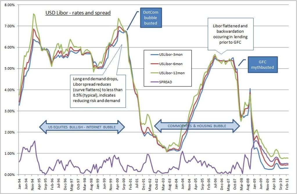
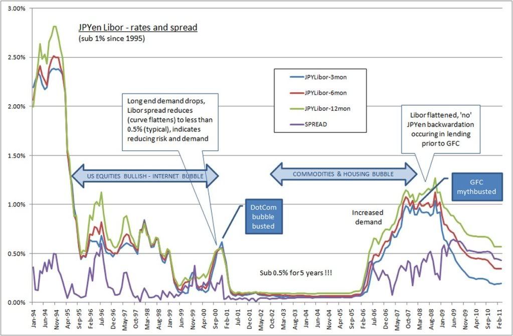
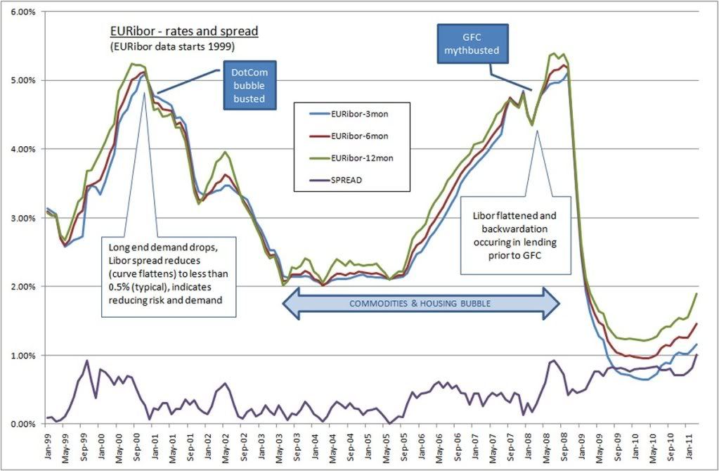
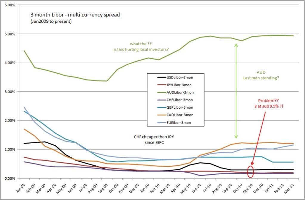
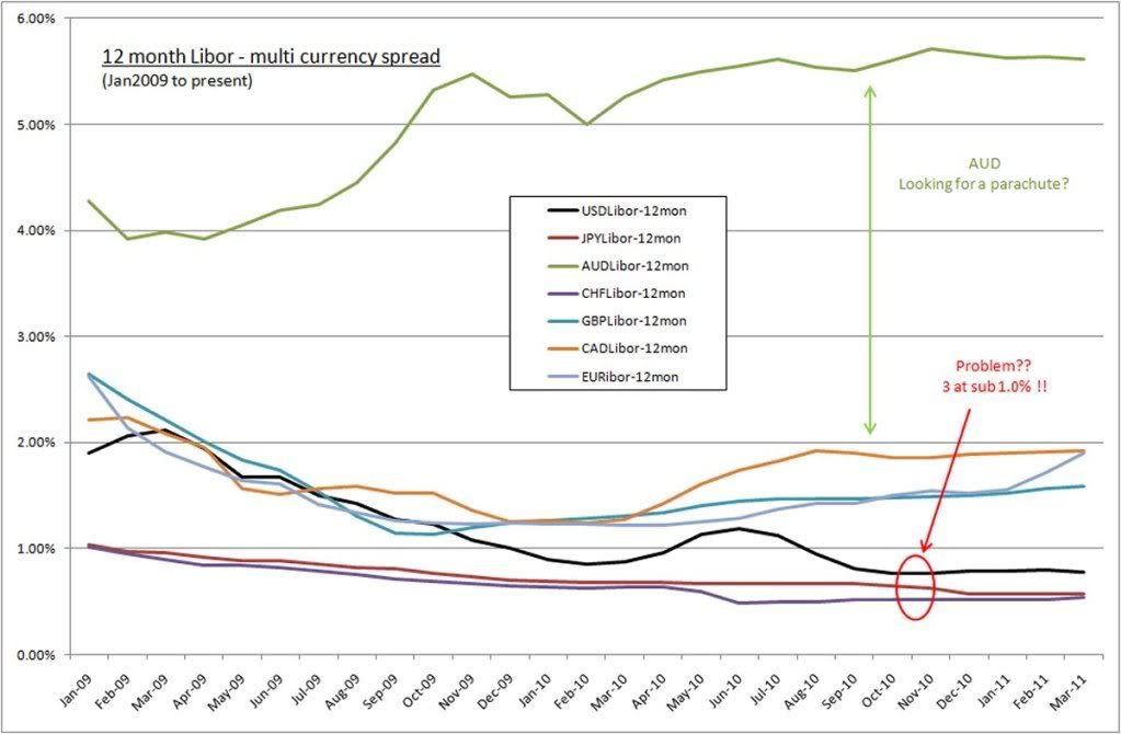
We have clearly seen aspects of stagflation/deflation in spite of the new QE2 being tabled by the US. At best it remains a transitional market at the moment historically low Libors in CHF, YEN and USD providing cheap lending to those with access. The news for the EU is still generally more reasonable than that for the US - both have serious debt problems to overcome. The difference being that the EU has Germany as a powerhouse. Are Germany's opportunities reaching their limits?

I am suggesting at this point in time that this fall in the USD will continue on a weak bias to US economics over strength bias to EU.

Time will tell how decisive the next week moves in the USD are across various pairs. 77.0 is now overhead resistance and might be a ceiling for the USDi for a while until signs of real growth appear from somewhere. More volatility in trading is virtually assured with such low levels of lending available across various currencies.

regards to all, and safe trading
LH

Disclaimer: These are my personal opinions only. Any viewing or use of information provided by me is done so entirely at your own risk. I go to extensive efforts to ensure data available to me is up to date and accurate. I will not accept any liability for loss or damage arising from the above inclusive of errors, omissions or just plain ignorance. Trading can result in significant financial losses.

Thursday, March 24, 2011

Hindenburg indicators - updated 25Mar2011

25Mar2011 Aus time - after overnight trading in the US ratios NYSE=12.5 (flat/rising); NASDAQ=5.9 (rising); SPX 50dma stocks=304 (rising). Entering longs with close stops at recent lows for equities showing confirmed downtrend breakout. Libor's and rising OIS rates support buying dips on speculation.

VIX index is below 20, but has technically broken a down trend (bad overall, temporarily safe).

H/L ratio's below 2.0 provide similar circumstances to the 2008 market tank.

-------------- 24Mar2011
An update on previous post on the indicators that underly the Hindenburg call - signalling a market top. Note, this signal is clearer with stronger upward trends. Since mid 2010, equities have moved up in this period, but 52week lows within this time would be fairly flat.

Thus knowledge flows like water - Hindeberg Omen explained pretty well

...using the H/L ratios of NYSE and NASDAQ. The previous post covers the period back to Jul/Aug 2004. Lower to sideways remains likely from current levels.

The actual signal is very choppy and noisy - but using the MA's in the background shows the concern in these trends.

NYSE using NYHLR - note the MA for guidance, higher is better,
- signal above MA's is upwards trend, currently indicating sideways/down market

The recent NYSE NYHLR signal you can get here
(note the ratio can go to zero)

Nasdaq seems to have a reliable history of trending H/L ratio -
- below MA's is a weak market, higher is better


Up above it is always a positive. Both indexes could be showing a H&S pattern with the head at Jan 2011. A positive is they are yet to make new lower lows.

The recent NASDAQ H/L Ratio signal you can get here
(note the ratio can go to zero)

Another trend is the number of S&P500 stocks trading above the 50 day moving average -
currently exactly 50% (250#) are trading above the 50 day MA, with this signal below it's MA's indicating a similar outcome to the above ratios

Count of S&P500 stocks above 50DMA (out of 500)


It supports the fact that markets top out on neutral underlying stock performance - that is stocks top before the market tops.

Food for thought in choppy sideways markets - but be cautious nonetheless. Close failing long equity positions and hold off until these indicators claim at least the lowest MA for a positive trend change.

Tuesday, March 22, 2011

Libor, EURibor - various lending sources

Here are some interesting summaries of interbank lending statistics since 1995. Warning - this is long, with charts at the bottom.

I have no idea how my stuff reads, or even if people find it useful. I spent a boatload of time researching the root to the fruit for signs of solidarity within the investing community before sinking the house into the markets ... again. Not much discussion comes from it but it is still ultimately useful to me and what I do.

The source of speculation is to either risk your own capital stock or to borrow money. Libor is the reference rate across the worls for large lending of new investment stock.

Looking at the Libor spreads is similar to analysing the Treasury yield spreads and yield curves. For instance, the Yen was recently used via the overnight, 1week, 2week and 1month lending facilities in the 15Mar2011 Yen/equity shock. Have a look at the Yen Libor for those periods - there was a large and sudden inrush of demand = speculation similar to the May2010 flashcrash. Repatriation has yet to really start, or has been squashed by speculation.

Some charts below - summary points first

0. Analysing Libor spreads is very similar but opposite in one key aspect to analysing Treasury yields. A drop in yields is an 'increase' in demand, rising competition for yields and falling comparable growth (seeking a reduction in risk). A drop in Libor shows a 'decrease' in demand, but a similar rising competition for lending against the background of falling opportunity for growth. Falling yields indicate a decrease in performance in the broader market - so 'can' falling Libor, but there is an obvious sinister twist that comes with zero rate lending.

1. A surprise - the cheapest lending is currently via CHF, a healthy 15% on ave cheaper to borrow in CHF than YEN across all terms out to 12months. Are the Swiss desperate to generate activity??? This low Libor generates interest in making the CHF stronger in demand over the USD. Likewise for the Yen.

2. This is concerning, given these low rates of lending can amount to increased demand for CHF and YEN - so this is the hypocrisy if the SNB and BOJ worried about the demand (strength) for their currencies, why don't they set/raise lending rates???This will decrease demand for those pairs - typically raising interest rates raises demand for pairs indicating improved investment opportunities. But why not just raise lending rates? Likely to be because they cannot afford to dampen reduced demand - is this a normal market for this standard thinking to occur?

Looking at the broader Libor, a large problem festering is where is global investor growth going to come from in sufficient quantities to increase lending demand that raises these lending rates, and get lending rates back up to competitive levels across the board. What if low lending rates are caused by an excess of competition? Pre2008, it was only the Yen.

Central Banks are not interested in setting a minimum lending benchmark - letting primary bank lending demand set the rate instead. The charts below show how unsuccessful this has been to date.

3. Since Libors are a floating rate tool set by the primary lending banks, if there is no demand for lending (their majority revenue stream) they need to drop rates.
Likewise, they control the amount of lending by raising rates with the lending demand. If there is too much competition for lending, they are faced with a likewise scenario to compete with lower rates.

4. Low Libor rates currently indicate either (a) reduced demand for lending or (b) increased competition in investment lending. (a) results in slow to attract borrowing and lack of growth. If it is a lack of demand as a result of a lack of expectation/opportunity - then large investors could be sitting on the fence before committing more capital. This is a worry. But in conjunction with this, we have record high commodity prices???? It is counter intuitive, but raising lending rates might balance out the sense and sensibility of speculation. Unless there is an excess of lending creating too much competition that requires central banks to drop Libor to get some business. This would fuel speculation and drive commodities even higher.

5. There are 3 currencies with long term (12months) lending below 1%. These are CHF, YEN and USD - again the lack of a large demand being a probable reason for this need, against a backdrop of low expectation/opportunity for return. The risk does not favour the reward. But now with 3 major currencies at sub 1% lending, the risk is increased to create excessive competition - bebcoming a race to the bottom.

6. EUR, GBP and CAD are doing reasonably better to attract demand for lending at more nominal rates more indicative of growth and stability. The EUR remains in higher demand inspite of higher interest rates and lending rates than the USD and YEN. A clear indication that the EUR so far is more stable in generating real investment growth in preference to the lack of opportunity in the US. A trade surplus with a smaller budget deficit is no doubt an enormous advantage due only to Germany's excellent performance. The US has a massive trade deficit and deliberately expanded it's budget deficit. Good luck with that.

7. Australia is the single standout by 4 country miles. It is showing demand for lending nearer to 5%(3-4% higher than the majors) and the RBA is attempting to curb the overhang in local lending even still. You can imagine the bubble otherwise, with the accompanying inflation. This situation is compounded by cheaper foreign direct investment without a doubt.

8. Australia's interest rates would be representative of Brazil and China if they had similar available data. These economies are dealing with inflation due to increased demand and are needing to control it using interest rates to avoid problems. These centres like Euro and Canada (to a lesser extent) represent where real investment growth remains to any fundamental degree. But for how long?

9. The biggest problem I see is with cheap cross border foreign investment using USD, YEN and CHF. Access to these facilities would have to choke out local investors from their own markets. Something I believe we are seeing in Australia and the reason the RBA is keeping interest rates higher - unfortunately this is not helping local investors. If low Libor is due to an excess of competition, then global markets are overcapitalised due to a lack of opporutnity, and too much idle capital. This is an inflationary knifeedge if it's the case.

10. In terms of the health of the turnaround since GFC, the structure of the Libor spreads for EUR, YEN and USD look healthy and orderly. The low levels of the YEN and USD remain a problem.

11. One consistent observation is the duration/risk/reward structure that is the Libor spread similar to bond yields. Longer durations incur higher risk and therefore cost more. Interesting is when you see Libor spreads contract, the demand for long duration lending contracts and the cost of borrowing falls. This falls in the same sequence treasury yields fall - longest first. The long end contracts, and you see a backwardation in lending rates - it is more expensive to borrow shorter than longer. Signs of a likely trend change which leads a market turn.

12. Lastly, the competition between CHF/YEN/USD 'has to' impact the demand for the various currencies, and hence the broader currency markets. The fundamentals around having low Libor in the first place is concerning. But to have 3 of the world major currencies in the same situation is not reassuring at all. Purchasing power parity (PPP) is a means of determining exchange rates based on GDP growth and investment value opportunities. But these levels of lending are likely to skew fundamentals for some time. This is at the very core of currency manipulation.

To wrap it up - Zero interest lending does not encourage better risk assessment and improved investing conditions at all. It encourages speculation and reckless volatility by taking advantage of low volume markets with a reduced risk of loss. This is far more dangerous than it is healthy. A reason why we have record high commodities in amidst of low broader economic growth with record volatility. It is unlikely to me that we will see double digit broader rates of growth like what occured in 1996-2000 and 2005-2008. They were fabricated growth based on unsound underlying assets.

Watch for deliberate schyzophrenic volatility being sold under the cover of civil war or natural disaster responses. It is caused by cheap lending in the primary money market. Look for the growth within the stagnation, avoid those that are too big, too slow and too fat with too much debt and too little revenue.

2004 to 2008 made more billionaires than other other cumulative time in all prior history back to before the Egyptions. The competitive rates on the CHF/YEN/USD cannot be a good thing. The longer it lasts, the worse things will be.

Finally! The charts that started it all ....
USD Libor from 1994 to 2011 - note sub 1% interest up to 12month Libor
USD Libor spread - historical - click image

JPYen Libor from 1994 to 2011 - note sub 1% interest since 1995
JPYen Libor spread - historical - click image

EURibor from 1999 to 2011 - a more normal response to supply/demand/growth
EURibor spread - historical - click image

3 month Libor multicurrency spread 2009 to 2011
The AUD is on it's own, the CHF/YEN/USD are in a race to the bottom
3month Libor multicurrency - click image

12 month Libor multicurrency spread 2009 to 2011
The AUD is on it's own, the CHF/YEN/USD are in a race to the bottom
12month Libor multicurrency - click image

As I see it, Libor is close to ground zero for the whole financial system. The root for the fruit as they say. Nothing I read about the US budget deficits in conjunction with the 3 lowest Libor rates being where they are makes me warm and fuzzy.

I miss that feeling - ignorance was bliss(;o) We need another bubble. Any thoughts?

As for currencies, they will pick apart all and any weekness in the EUR, China and AUD - that's all they have left. Emerging markets have done well to weather the flood of foreign investment. What Brazil did was magnificent self protection (an investment tax). The repatriation into Yen took 3 months after Kobe, so we are yet to really see a Yen flow of funds with any earnest. You don't move 1000pips in 3 days (UJ and AJ) in fundamentally sound markets.

US borrowing at US libor will sell down the USD buying anything offshore USA so that will counter any move they have in lifting the USD. Only good for US equities as I see it, so a weaker USD is virtually a given. This helps their pathetic balance of trade anyways.Just trying to pick the threads amongst the sea of ignorant commentators. No-one seems interested in the Libor issue - odd seeing how fundamental it appears to a great many things.

The AUD lending rates are surreal by comparison. Not sure many realise the harmful effects this has for local AUS investors when offshore investors have such cheap source of finance. The RBA would not enjoy the position they have presently.Any shock to the AUD might be due to foreigners fleeing the country maybe. UJ and AJ was almost understandable for a day or so.A very good time to swing trade using basic patterns I think. This volatility might be around for a while.